Shiny Climate
Shiny-Climate: Exploring Climate Change in R Shiny
Drew King (they/them) kingdrew@uw.edu
Derek Liu (he/him) deliu@uw.edu
Introduction
Creating visualizations comparing climate change data on carbon emissions and global temperature changes over time using data that has already been collected. Goal of establishing relationship between CO2 output over time with climate change, along with understanding which regions are most responsible for and impacted by climate change. The results are published in an R Shiny app.
R Shiny App
The R Shiny app can be found on shinyapps.io at this link with each visualization described below in order:
-
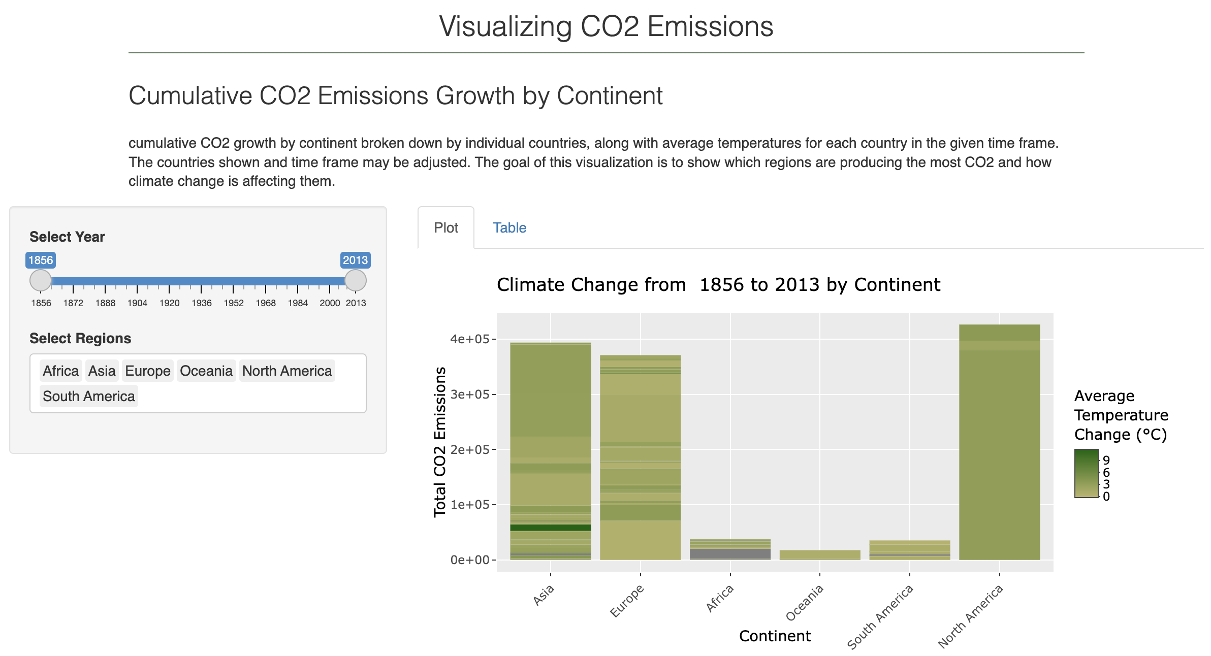
The first visualization included is cumulative CO2 growth by continent broken down by individual countries, along with average temperatures for each country in the given time frame. The countries shown and time frame may be adjusted. The goal of this visualization is to show which regions are producing the most CO2 and how climate change is affecting them.
-
The second visualization (in progress) is CO2 emissions by continent over time, the goal of this visualization is to show general CO2 growth over time as well as which continents are producing the most CO2.
-
The third visualization (in progress) is Temperature Change over time by continent, broken down into minimum temperatures, average temperatures, and maximum temperatures. The goal of this visualization is to show which regions are most impacted by climate change.
Dataset
Two datasets were used, both of which can be found on Kaggle. One is CO2 Emissions over time by country, the other is Temperature data over time from Berkeley Earth. They can be found here:
In the agg.R script, these country temperature data set from Berkeley Earth and the Complete CO2 Emissions data set are merged together to create a more complete data set that includes both CO2 growth and temperature change. This aggregated data set is used by the app to create visualizations that would not be possible without merging the data together.
Results
When visualizing CO2 output by continent with countries visible, three major countries are visible on this chart. China, Germany, and The United States are the three biggest global polluters. Unsurprisingly, these countries also have the largest GDP’s globally. Additionally most of the carbon growth globally has happened between 1930 and the present, with an upward trend for each year.
Further Questions
It is paramount to explore in further depth the relationship between GDP and emission of climate change causing chemicals. It is possible that existing economic activity could be a direct cause of climate change. Policymakers may need to consider new measurements of economic growth that consider climate change as a threat to global wellbeing and to measure economies not only by quantity of economic output but also quality.

